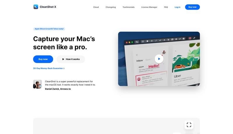
Overview
This system should feel like a polished desktop utility page that trusts clarity over theatrics. Use wide white breathing room, large black headlines, and one or two obvious blue calls to action. Product mockups should carry most of the storytelling weight, while the surrounding interface stays calm. The page should read as practical and platform-native. Soft-gray stages can gather groups of features or tool palettes, but they should never overpower the product itself. The strongest emphasis move is still the blue action pill.