Saugat
Home
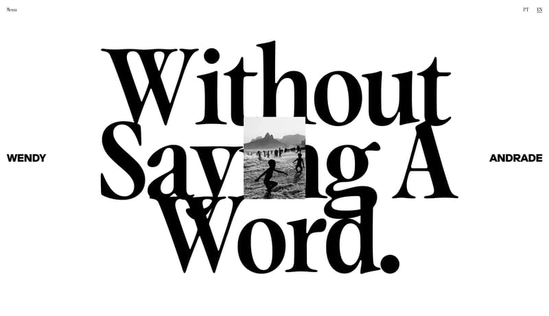
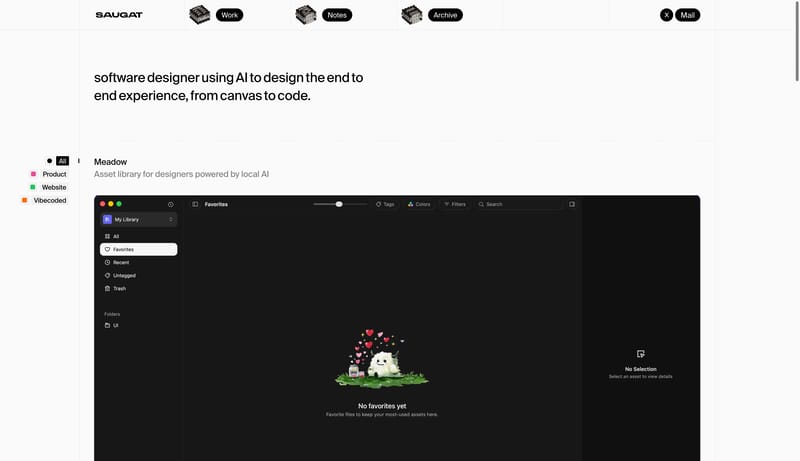
Use a quiet white portfolio ledger: visible grid rails, black pill navigation, tiny category filters, large screenshots, and occasional paper-note interactions.
Open exampleCategory
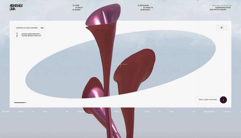
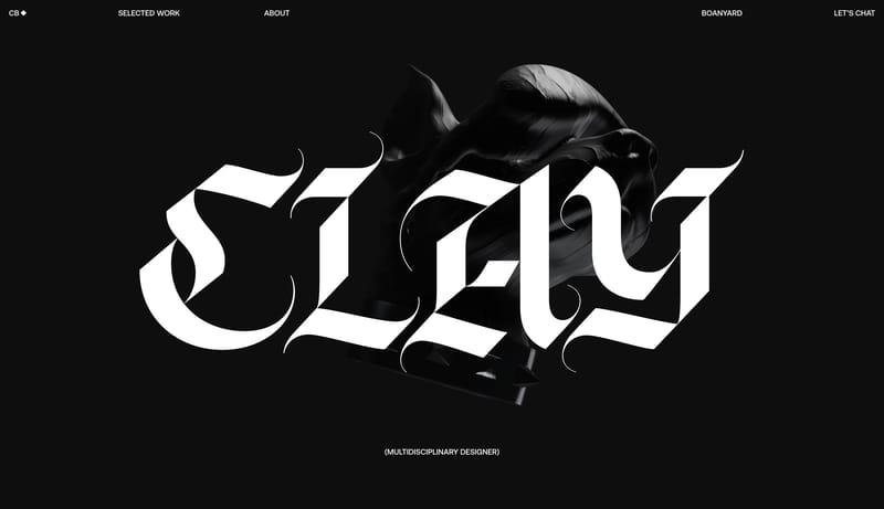
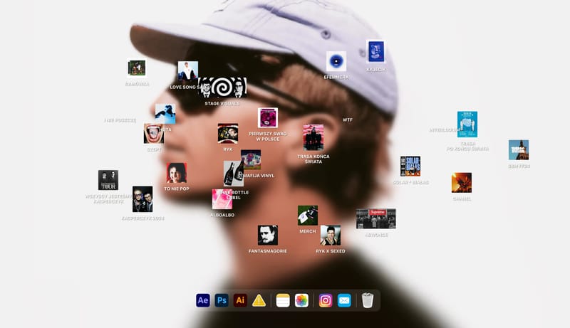
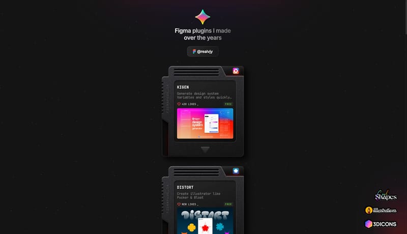
Browse 32 curated Personal website examples to study positioning, page structure, conversion patterns, and product storytelling across modern websites.
What To Study
Compare how Personal products introduce value, sequence content blocks, frame trust, and turn visitors into qualified users or customers.
What To Compare
Focus on headline angle, proof blocks, navigation depth, pricing exposure, and how quickly Personal sites communicate their offer.
Design Analysis
Use a quiet white portfolio ledger: visible grid rails, black pill navigation, tiny category filters, large screenshots, and occasional paper-note interactions.
Saugat
Home
Use a quiet white portfolio ledger: visible grid rails, black pill navigation, tiny category filters, large screenshots, and occasional paper-note interactions.
Open exampleUse these internal hubs to keep branching from Personal into broader design research, structured design analysis, or adjacent website inspiration taxonomies.
Hub
Return to the broader categories hub if you want to branch into adjacent topics beyond Personal.
Related Hub
Browse pages grouped by repeated design signals when you want inspiration organized by visual patterns instead of taxonomy alone.
Related Hub
Study structured design analysis, reusable tokens, and AI-readable system guidance tied back to real production websites.
Workflow Collection
SaaS landing pages, product-marketing references, and tools for teams shaping B2B software sites.
Workflow Collection
Website inspiration and related tools for AI startups, AI products, assistants, and agent-first launches.
Workflow Collection
Portfolio references and related tools for studios, personal brands, creative developers, and case-study-led sites.
Explore More
Switch to the styles hub to compare Personal inspiration against a different browsing dimension.
Explore More
Switch to the sections hub to compare Personal inspiration against a different browsing dimension.
Explore More
Switch to the markers hub to compare Personal inspiration against a different browsing dimension.
You can compare how Personal websites structure positioning, product explanation, proof, conversion flow, and page hierarchy across real products.
This page currently includes 32 curated Personal references with screenshot and version context so you can compare patterns instead of isolated visuals.