
App Flow

App Flow

We partner with the world’s top companies to help them unlock the full potential of React Native and Expo.

4.0
4
Visits
Visit

Available Pages

Version History

Design Analysis

App Flow Home design analysis

--- version: alpha name: Tactile Control Console description: Sparse industrial-soft studio system with pale gray negative space, oversized tactile dial imagery, chartreuse control accents, and dark pill actions. colors:...

Key Takeaways

  • Primary ( 121212): Main text and primary CTA fill.
  • Secondary ( D8D8D8): Metal and support surface tone.
  • Tertiary ( E6F66A): Main control highlight.
  • Display: Slightly softer industrial sans with room to feel human.
  • Body: Neutral and unobtrusive.
  • Labels: Compact and utilitarian.

Overview

Tactile Control Console is a sparse studio system that uses one oversized industrial-soft object to carry most of the identity. The page should feel almost empty in the best way: pale-gray shell, disciplined black type, one focused signal color, and a hero metaphor that feels physically touchable.
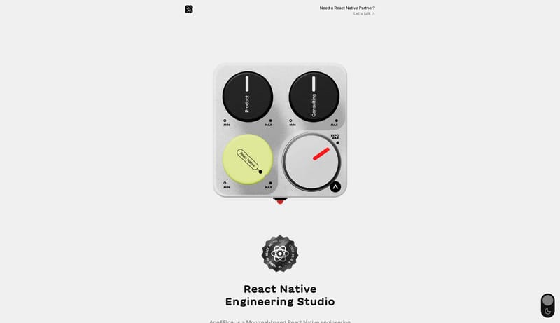
Image Direction

Use tactile renders, dial-like controls, metal surfaces, and soft industrial detailing. Imagery should feel engineered and slightly playful, never generic 3D futurism.

Colors

The palette is mostly monochrome with one sharply focused highlight. A small red pointer accent can appear for calibration moments, but it should stay secondary to the chartreuse highlight.

  • Primary ( 121212): Main text and primary CTA fill.
  • Secondary ( D8D8D8): Metal and support surface tone.
  • Tertiary ( E6F66A): Main control highlight.

Typography

Typography should stay restrained so the tactile object remains the emotional center.

  • Display: Slightly softer industrial sans with room to feel human.
  • Body: Neutral and unobtrusive.
  • Labels: Compact and utilitarian.
SpacePlay/PauseSeek 1sShiftSeek 10s