Design Analysis
What stands out in Horizontal Scrolling websites
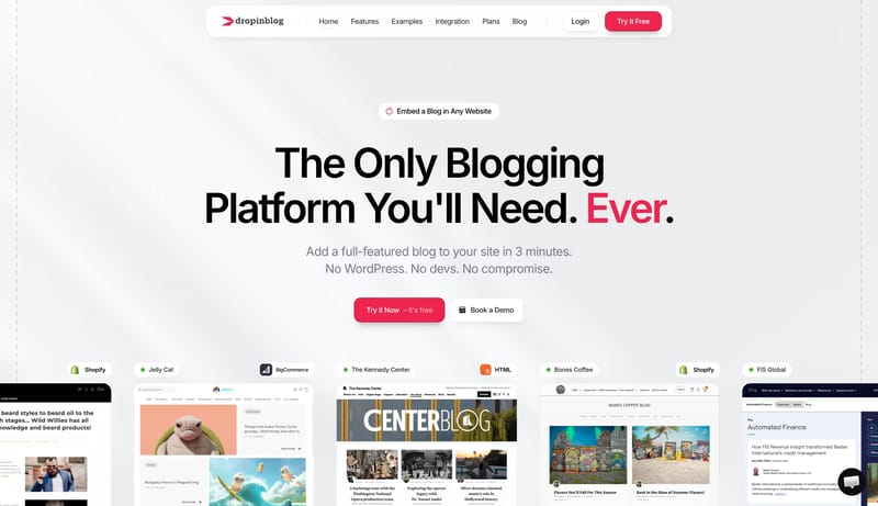
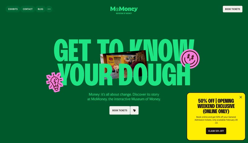
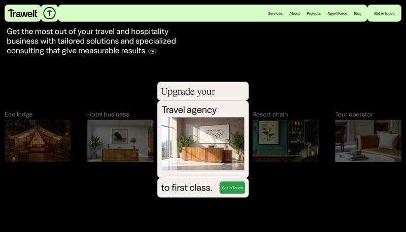
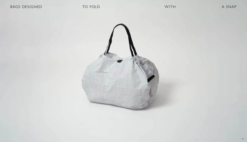
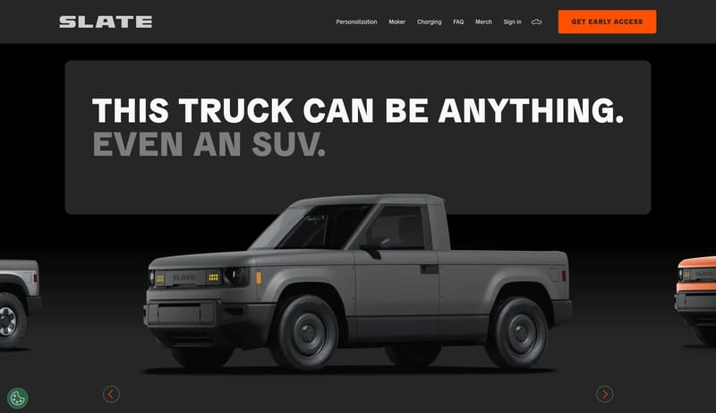
Soft Commerce Publishing is a bright, product-led system that feels polished without becoming sterile. It uses huge black headlines, a floating rounded navigation shell, and a single coral-red action color to make embedd... Build the experience as a long teach...
Soft Commerce Publishing is a bright, product-led system that feels polished without becoming sterile. It uses huge black headlines, a floating rounded navigation shell, and a single coral-red action color to make embedd...
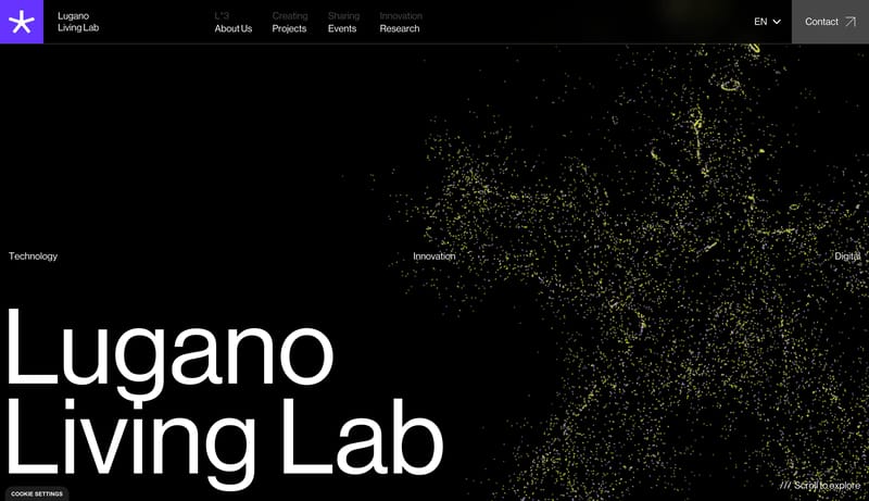
Open exampleMotion Graphic Design
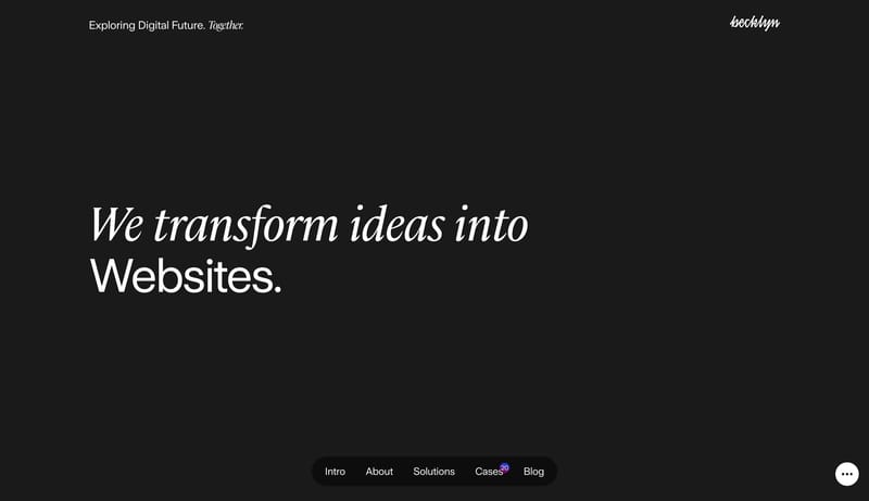
Home
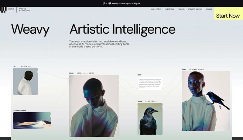
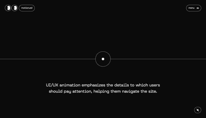
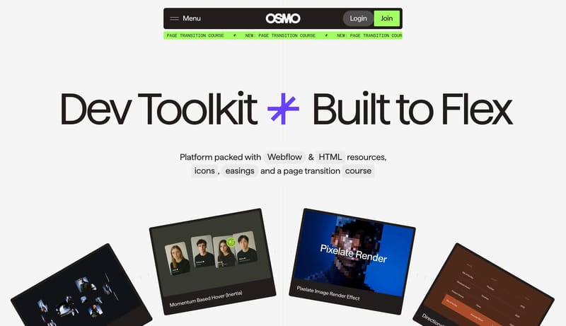
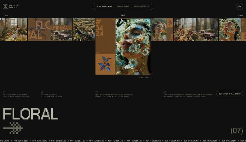
Build the experience as a long teaching corridor on a black field. Let one concept dominate one chapter plate at a time. Treat motion as the teaching method, not as garnish. Use wireframe diagrams, tiny embedded screensh...
- Build the experience as a long teaching corridor on a black field.
- Let one concept dominate one chapter plate at a time.
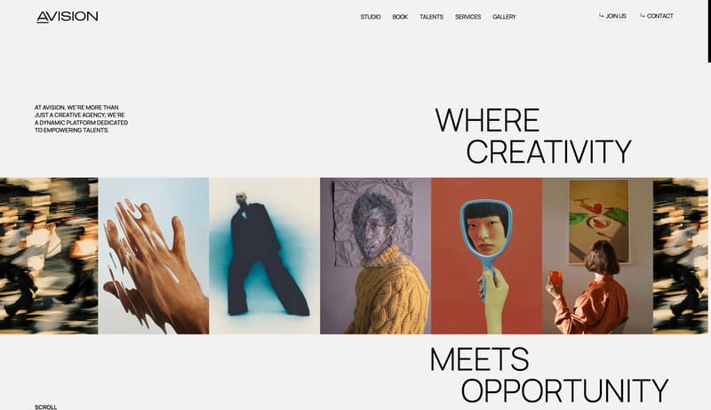
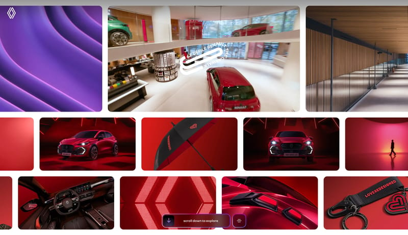
Open exampleUse a playful creative-development system: huge flexible type, centered black nav, lime membership actions, mono ticker strips, split-axis layouts, tilted resource cards, and confident light/dark mode shifts.
Open example