Fey
Home
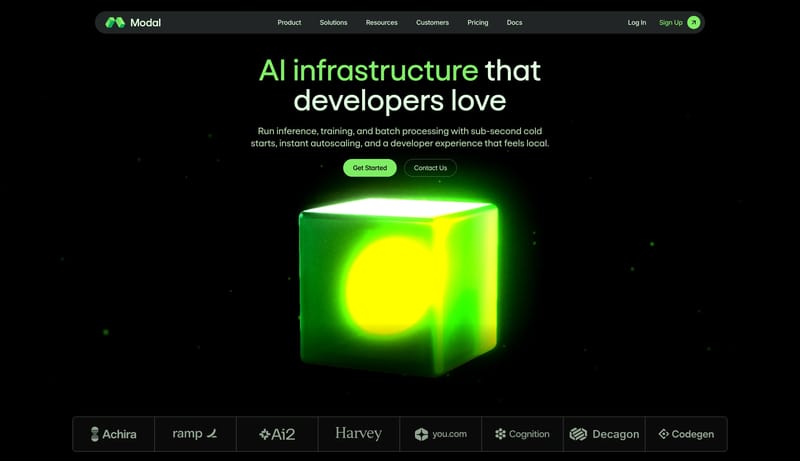
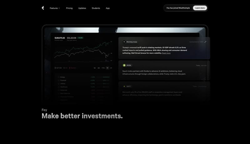
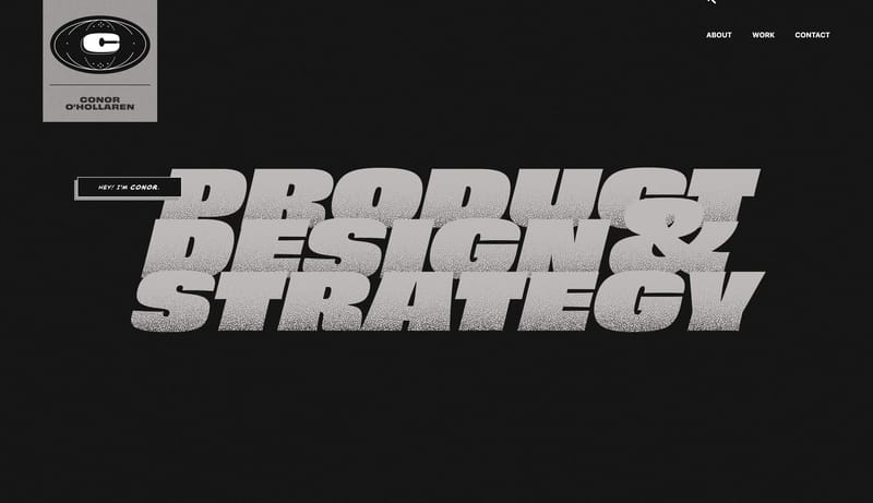
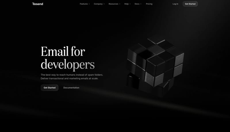
Obsidian Analyst Glass is a dark luxury-product system for investment analysis and recap workflows. The page should feel like a premium terminal seen through softened glass: controlled, quiet, and information-dense witho...
Open exampleStyle
Browse 108 curated Dark website examples to review visual direction, typography, color systems, motion, and overall brand expression.
What To Look For
Study how Dark style decisions affect first impression, readability, visual tension, motion, and the overall feel of the product.
What To Compare
Pay attention to color contrast, type pairings, spacing density, illustration treatment, motion restraint, and how the Dark style stays consistent across the page.
Design Analysis
Obsidian Analyst Glass is a dark luxury-product system for investment analysis and recap workflows. The page should feel like a premium terminal seen through softened glass: controlled, quiet, and information-dense witho... Midnight Builder Marquee is a black-...
Fey
Home
Obsidian Analyst Glass is a dark luxury-product system for investment analysis and recap workflows. The page should feel like a premium terminal seen through softened glass: controlled, quiet, and information-dense witho...
Open exampleFramer
Home
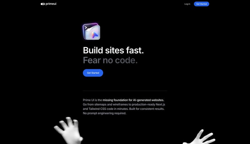
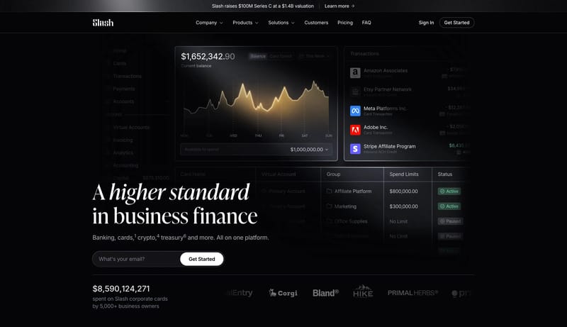
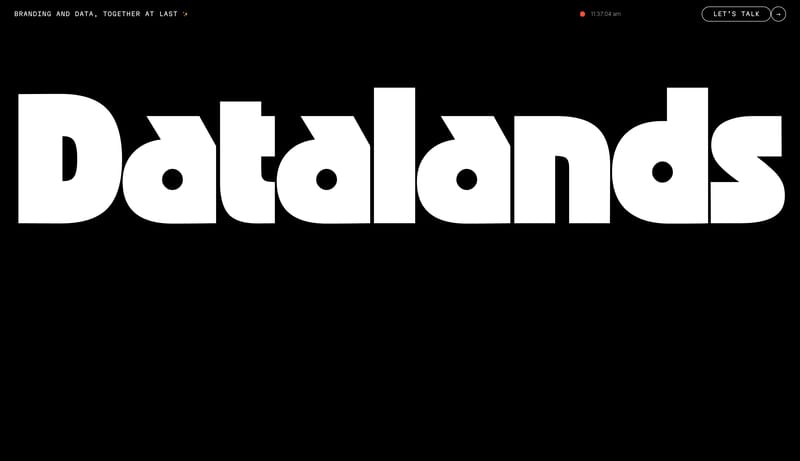
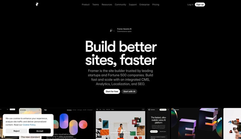
Midnight Builder Marquee is a black-first launch system that sells speed and polish through reduction. The shell should feel almost empty at first glance: one oversized white headline, one short block of cool-gray suppor...
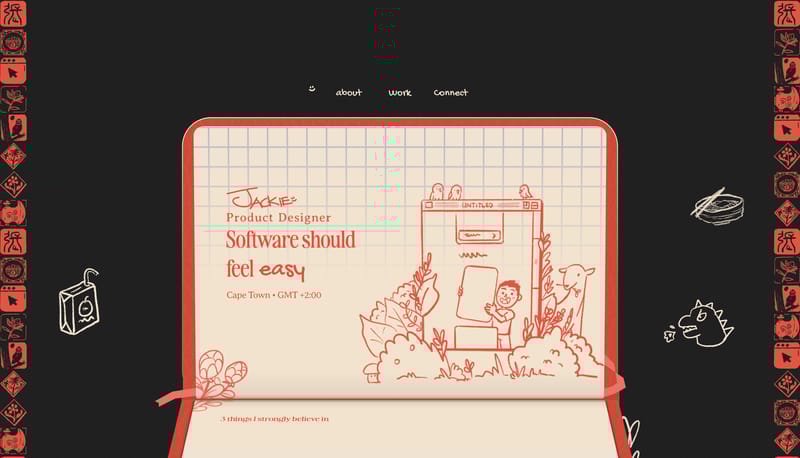
Jackie Zhang
Home
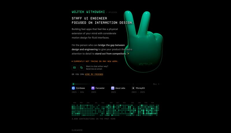
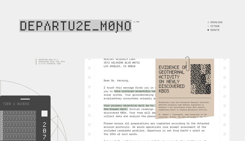
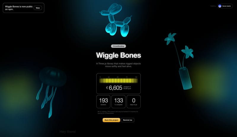
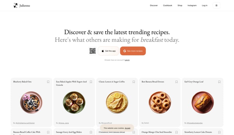
Build the experience as a dark stage with one dominant warm paper object carrying the main story. Let the interface feel handmade, but not sloppy: every doodle, sticker, and offset layer should still support clear readin...
Use these internal hubs to keep branching from Dark into broader design research, structured design analysis, or adjacent website inspiration taxonomies.
Hub
Return to the broader styles hub if you want to branch into adjacent topics beyond Dark.
Related Hub
Browse pages grouped by repeated design signals when you want inspiration organized by visual patterns instead of taxonomy alone.
Related Hub
Study structured design analysis, reusable tokens, and AI-readable system guidance tied back to real production websites.
Workflow Collection
Portfolio references and related tools for studios, personal brands, creative developers, and case-study-led sites.
Workflow Collection
Collections for vibe-coded sites, AI website builders, and fast-moving prompt-to-product workflows.
Workflow Collection
A broader collection of AI product references, AI website examples, design-system examples, and workflow tools.
Explore More
Switch to the categories hub to compare Dark inspiration against a different browsing dimension.
Explore More
Switch to the sections hub to compare Dark inspiration against a different browsing dimension.
Explore More
Switch to the markers hub to compare Dark inspiration against a different browsing dimension.
It helps you compare visual tone, typography, color systems, spacing density, illustration treatment, and motion choices used in Dark website design.
Use them to calibrate creative direction, collect mood references, and decide which visual traits feel distinctive enough to adapt for your own product.


