Keeby
Home
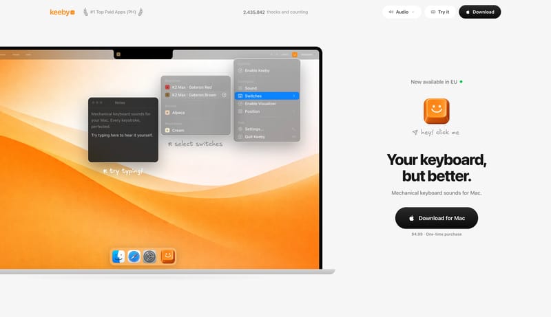
Build for a consumer Mac utility with a lot of confidence in one single demo scene. Keep the page visually sparse. Empty space is part of the product story. Let the hero feel playful and tangible rather than technical or...
- Build for a consumer Mac utility with a lot of confidence in one single demo scene.
- Keep the page visually sparse. Empty space is part of the product story.