
Paper

Paper

Paper is a modern and powerful design tool that helps you create, share, and ship your best work.

3.0
1
Visits
Visit

Available Pages

Design Analysis

Paper Home design analysis

--- version: alpha name: Drafting Paper Workspace description: Warm paper-toned product system with textured drafting surfaces, lowercase grotesk type, ruled measurement cues, and flat low-radius controls. colors: primar...

Key Takeaways

  • Primary ( 151515): Ink text and the main CTA fill.
  • Secondary ( F0EBDD): Grouped surface and soft panel tone.
  • Tertiary ( 8FB0FF): Sparse signal accent for emphasis or tiny brand notes.
  • Display: Large, calm, and slightly dense, with conversational lowercase rhythm.
  • Body: Plain and evenly spaced.
  • Utility: Mono only for sparse drafting cues, measurement marks, or technical annotation.

Overview

Drafting Paper Workspace is a tactile light system that feels measured, warm, and anti-generic. The page should behave like a drafting board translated into software marketing: warm paper tone, subtle texture, ruled margins, deliberate lowercase statements, and one large connected-canvas proof object.
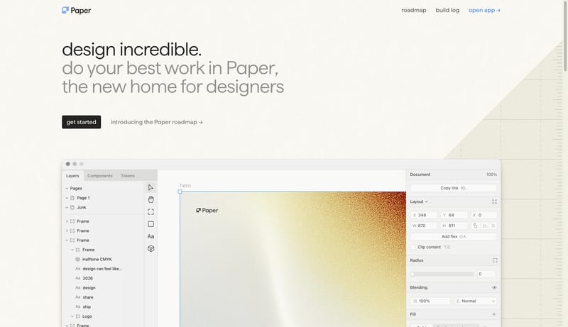
Image Direction

Use light software-window imagery and canvas crops as the main proof. Images should feel like working surfaces placed on a drafting table, not like glossy billboard renders.

Colors

The palette stays warm, quiet, and almost monochrome.

  • Primary ( 151515): Ink text and the main CTA fill.
  • Secondary ( F0EBDD): Grouped surface and soft panel tone.
  • Tertiary ( 8FB0FF): Sparse signal accent for emphasis or tiny brand notes.

Typography

Use one grounded grotesk across the system and let lowercase posture do the emotional work.

  • Display: Large, calm, and slightly dense, with conversational lowercase rhythm.
  • Body: Plain and evenly spaced.
  • Utility: Mono only for sparse drafting cues, measurement marks, or technical annotation.
SpacePlay/PauseSeek 1sShiftSeek 10s