Overview
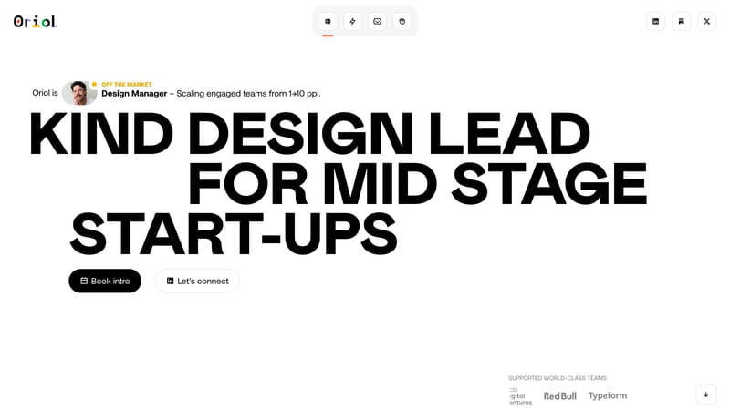
Build a system that feels kind, editorial, and sharply opinionated. A stark editorial portfolio system built from black hero pills, white outlined capsules, giant grotesk type, and orange-red proof cards.

Product design leader with 15+ years of experience leading start-ups and teams growth. Reach out for work & collab proposals in Barcelona and remotely as: Design Leader, Design Manager, Design Mentor.
Design Analysis
Build a system that feels kind, editorial, and sharply opinionated. A stark editorial portfolio system built from black hero pills, white outlined capsules, giant grotesk type, and orange-red proof cards.
Build a system that feels kind, editorial, and sharply opinionated. A stark editorial portfolio system built from black hero pills, white outlined capsules, giant grotesk type, and orange-red proof cards.
Use a dominant white field, quiet case modules, and a few bright proof cards that interrupt the calm. Visual density should stay low and deliberate.
Black and white carry the system. Orange-red is a concentrated accent for proof cards, while soft gray borders keep the white capsules and cards readable.
Use oversized grotesk type with strong compression and clarity. Supporting text should stay softer but never low-contrast enough to undermine readability.