Design Analysis
What stands out in Prices websites
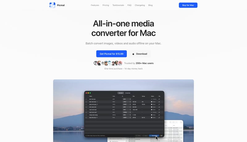
Treat the system like a clean utility manual: direct, efficient, and screenshot-led. Use blue actions to point the way without over-branding the shell. Let docs, changelog, and marketing all feel like one family. Use app... Build the page like a scenic paper s...
Treat the system like a clean utility manual: direct, efficient, and screenshot-led. Use blue actions to point the way without over-branding the shell. Let docs, changelog, and marketing all feel like one family. Use app...
- Treat the system like a clean utility manual: direct, efficient, and screenshot-led.
- Use blue actions to point the way without over-branding the shell.
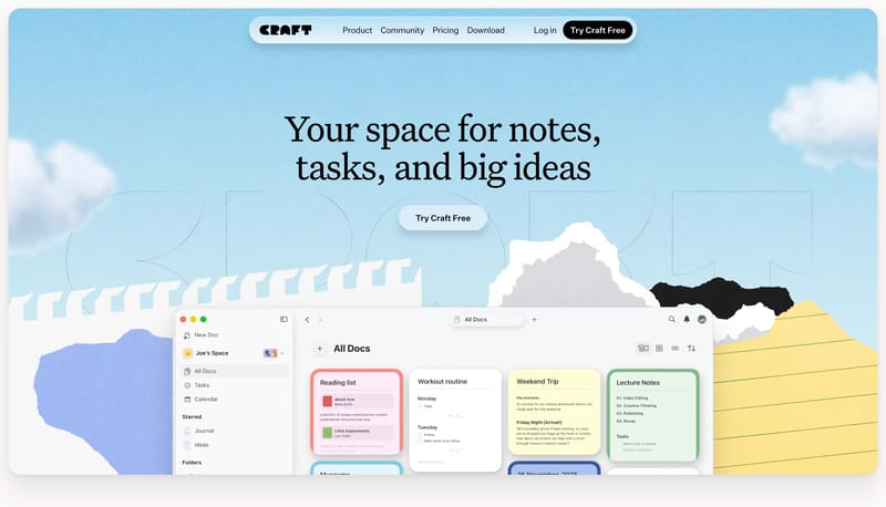
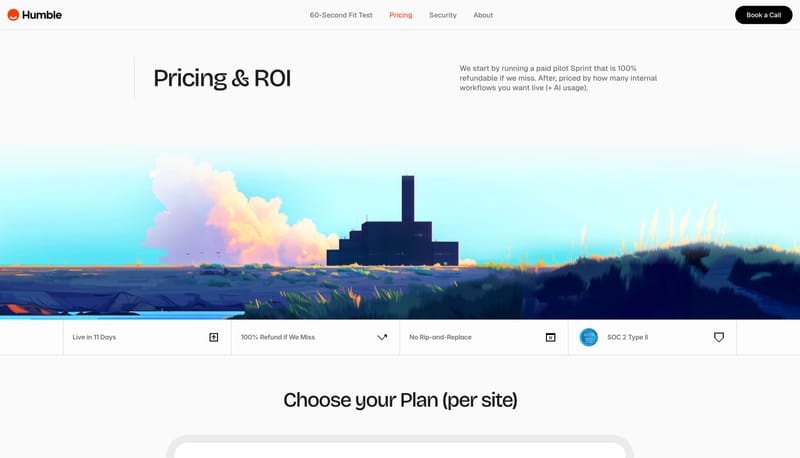
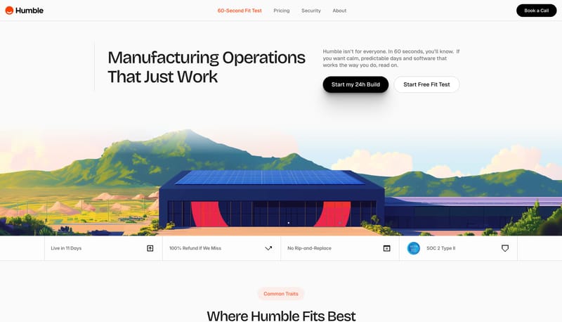
Open exampleBuild the page like a scenic paper stage rather than a plain app landing page. Let oversized serif headlines sit inside a sky-blue textured field framed by collage tears and clouds. Use black capsules and a floating roun...
- Build the page like a scenic paper stage rather than a plain app landing page.
- Let oversized serif headlines sit inside a sky-blue textured field framed by collage tears and clouds.
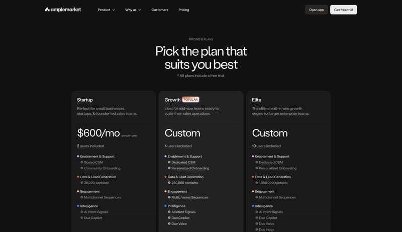
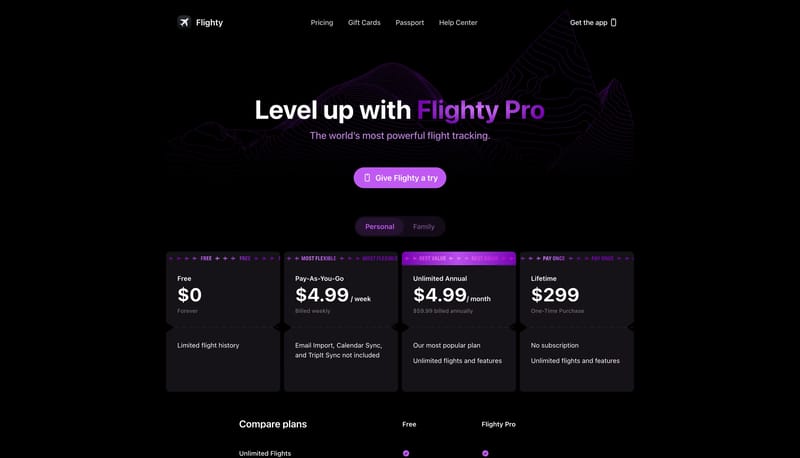
Open exampleBuild the interface as a mostly white field with just enough diagonal texture to keep it from feeling empty. Let type scale and capsule shape do the heavy lifting. The experience should feel direct, not decorated. Keep t...
- Build the interface as a mostly white field with just enough diagonal texture to keep it from feeling empty.
- Let type scale and capsule shape do the heavy lifting. The experience should feel direct, not decorated.
Open example