
Available Pages

Version History

Design Analysis

Jeton Home design analysis

--- version: alpha name: Coral Orbit Wallet description: Saturated consumer-finance system with coral-peach gradients, floating 3D disc forms, giant white sans display type, and capsule navigation. colors: primary: " FFF...

Key Takeaways

  • Primary is white and used for the most visible text and bright action surfaces.
  • Secondary is a muted taupe used for quiet support capsules.
  • Tertiary is a small blue utility accent.
  • Use one blunt, geometric sans throughout.
  • Make the display extremely large and simple.
  • Keep body copy light enough that color and form remain dominant.

Overview

Coral Orbit Wallet is a bold consumer-finance system that relies on color, scale, and soft 3D form more than dense explanation. It should feel large, mobile-native, and unmistakably upbeat: giant white statements, coral and peach gradients, glossy floating forms, and a persistent dock-like navigation cue.
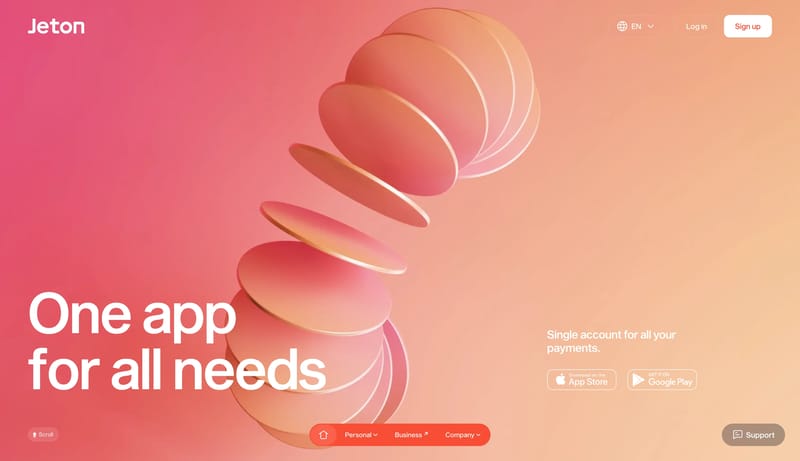
Image Direction

Use soft 3D forms, glossy disc-like objects, and simple lifestyle crops with lots of breathing room. Avoid hard technical rendering styles.

Colors

  • Primary is white and used for the most visible text and bright action surfaces.
  • Secondary is a muted taupe used for quiet support capsules.
  • Tertiary is a small blue utility accent.

Typography

  • Use one blunt, geometric sans throughout.
  • Make the display extremely large and simple.
  • Keep body copy light enough that color and form remain dominant.
SpacePlay/PauseSeek 1sShiftSeek 10s