
Available Pages

Version History

Design Analysis

Family Home design analysis

--- version: "alpha" name: "Playful Wallet Utility" description: "A friendly consumer-finance system that mixes black utility controls, cream support surfaces, rounded product shells, and bright mascot accents on a white...

Overview

Playful Wallet Utility is a consumer-facing system that softens financial software with mascots, rounded controls, and bright support accents while keeping the actual decision points crisp and black. It should feel approachable first, but never unserious.
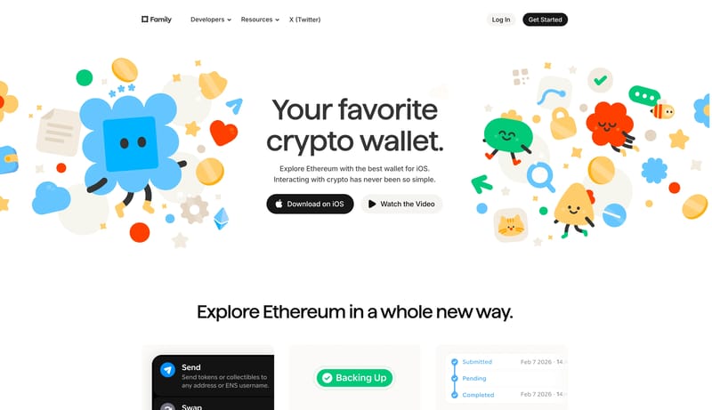
Image Direction

Favor rounded, toy-like illustrations or compact 3D objects with clean outlines, limited shading, and highly legible silhouettes. Use them as moments of delight around a disciplined layout, not as background wallpaper.

Colors

The foundation is plain white with cream support surfaces and black action controls. Bright blue can lead the accent set, with green, coral, and yellow available as supporting notes inside illustration or small UI moments. Keep the accent family punctuated and sparse so the product still reads as focused.

Typography

Use the branded display family for hero and section headlines, then rely on Inter for almost all interface, docs, and support copy. The tone should stay friendly and modern, not technical for its own sake. Mono belongs to code samples, changelog details, and compact metadata only.

SpacePlay/PauseSeek 1sShiftSeek 10s