Overview
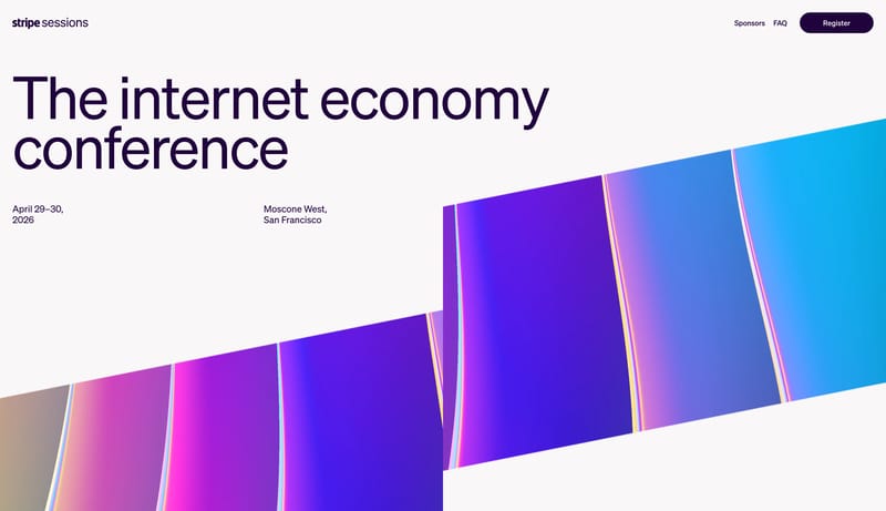
Design light event pages that feel premium, editorial, and current. The system should balance oversized headings and generous white space with one unmistakable prismatic visual language that makes the conference feel vivid without clutter.

Stripe Sessions is a 2-day, in-person event with discussions about important internet economy trends, the future of commerce, and Stripe product updates. Register now to secure your spot.
Design Analysis
Design light event pages that feel premium, editorial, and current. The system should balance oversized headings and generous white space with one unmistakable prismatic visual language that makes the conference feel viv...
Design light event pages that feel premium, editorial, and current. The system should balance oversized headings and generous white space with one unmistakable prismatic visual language that makes the conference feel vivid without clutter.
Use diagonal ribbon imagery with magenta, violet, and apricot light transitions as the core brand signal. Photos or videos should feel secondary to this geometric light treatment and should sit within a disciplined editorial frame.
Keep the background soft and neutral. Use deep plum for almost all typographic weight, with violet reserved for active states and ribbon lift. Let magenta and apricot show up primarily inside the hero artwork, not in generic components.
Use a single editorial sans across the system. Headlines can be huge, light, and tightly tracked, while body copy stays neutral and low-drama. This is a clean event poster voice, not a product dashboard voice.