Park
Home
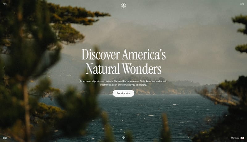
Grainlight Nature Archive should feel like a quiet field journal translated into a digital photography showcase. The shell stays warm and nearly invisible while the imagery does the emotional work: full-bleed mist, soft...
- Use a warm paper neutral for most of the shell.
- Let the imagery carry the richer blues, greens, and ochres.