Design Analysis
What stands out in Contact websites
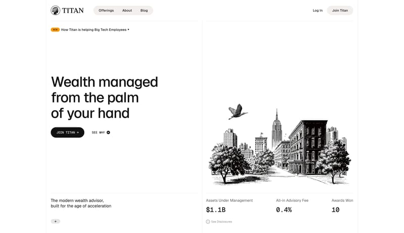
Editorial Advisor Ledger is a high-trust financial system that feels more like a modern ledger than a fintech app. Hairline rules, warm ivory grouping, and etched monochrome illustration create an atmosphere of patience... Forensic Grid Security is a security-...
Editorial Advisor Ledger is a high-trust financial system that feels more like a modern ledger than a fintech app. Hairline rules, warm ivory grouping, and etched monochrome illustration create an atmosphere of patience...
- Primary ( 111111): Main text and primary CTA fill.
- Secondary ( F2EEE8): Warm ivory chip grouping and subtle surface emphasis.
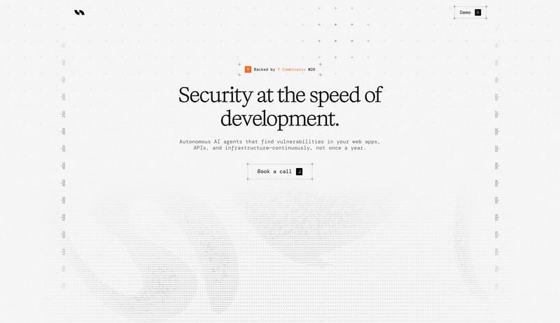
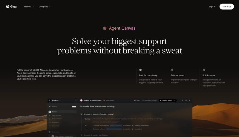
Open exampleForensic Grid Security is a security-marketing system that feels closer to a lab panel than a startup site. It balances formal serif headlines with mono annotation copy, sparse wireframes, and large off-white breathing z...
- Primary ( 000000): Main type, rules, and button outlines.
- Secondary ( DCDCDC): Map grid, section rules, and supporting wireframes.
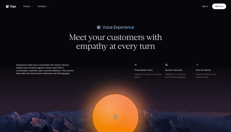
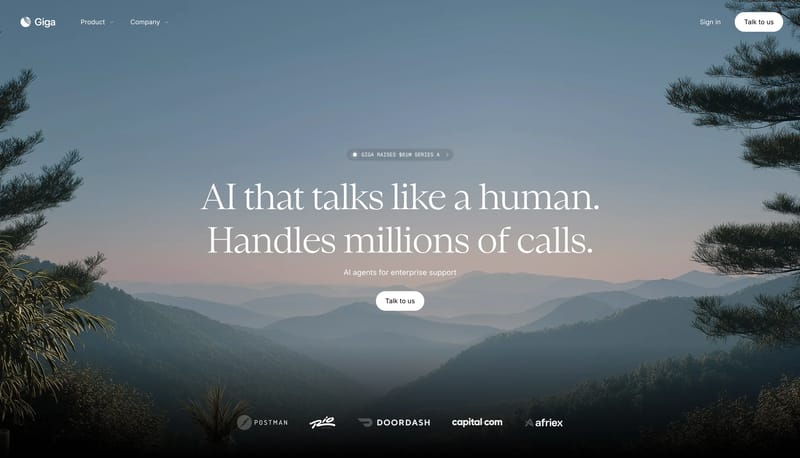
Open exampleBuild the experience as a calm horizon photograph with minimal white interface punctuation. Let the page feel cinematic and humane rather than technical for its own sake. Use small chips and one white pill to keep the in...
- Build the experience as a calm horizon photograph with minimal white interface punctuation.
- Let the page feel cinematic and humane rather than technical for its own sake.
Open example