Overview
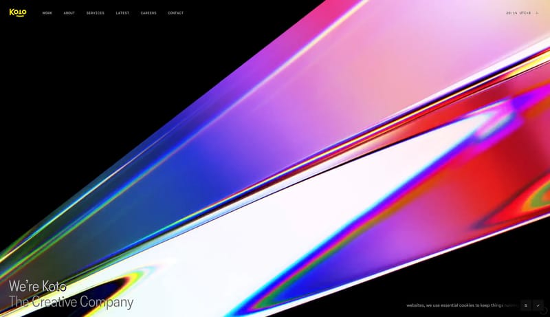
Midnight Signal Atelier is a gallery-first portfolio system. Black space is not empty filler here; it is an active structural material that makes typography, project posters, and signal accents feel deliberate and expensive.

Meet Koto — a creative studio that partners with brands to shape the future with optimism, collaboration, and craft. Come see what we’re building.
Design Analysis
Midnight Signal Atelier is a gallery-first portfolio system. Black space is not empty filler here; it is an active structural material that makes typography, project posters, and signal accents feel deliberate and expens...
Midnight Signal Atelier is a gallery-first portfolio system. Black space is not empty filler here; it is an active structural material that makes typography, project posters, and signal accents feel deliberate and expensive.
Treat imagery like curated campaign posters hung in sequence. Each visual should feel self-sufficient, bold, and large enough to carry a section on its own. Avoid thumbnail thinking, stock-photo behavior, or image overload.
Color works through scarcity.
Use a neutral modern grotesk for the main voice, then a tiny mono-like layer for utility labels.