Design Analysis
What stands out in Health websites
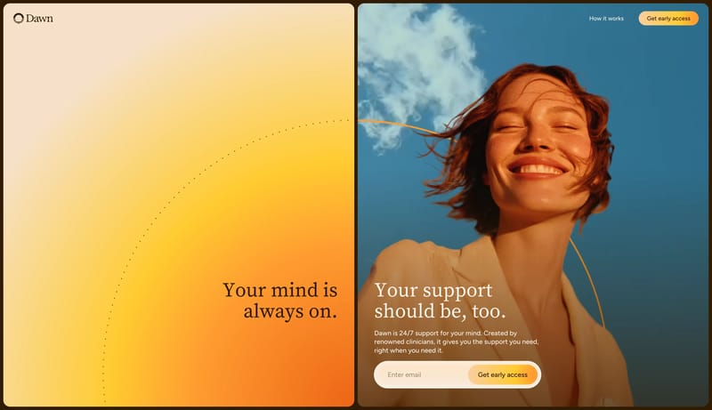
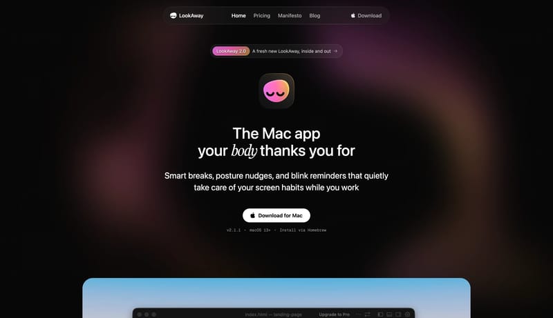
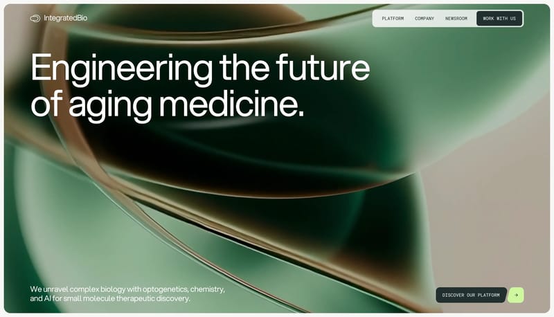
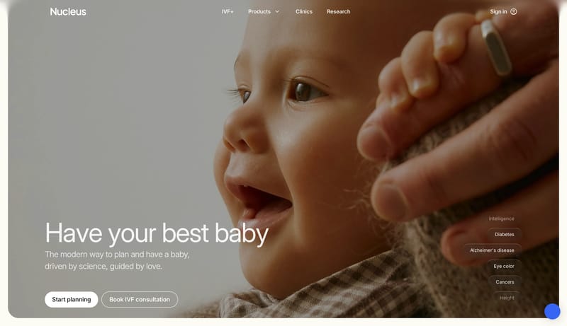
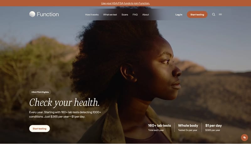
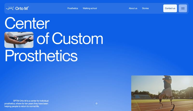
Keep the interface emotionally safe and gently optimistic. Use rounded macro-panels and warm gradients to avoid clinical coldness. Lead with reassurance and clarity, not with product complexity. Use warm sky photography... Keep the system quiet, pale, and card...
Keep the interface emotionally safe and gently optimistic. Use rounded macro-panels and warm gradients to avoid clinical coldness. Lead with reassurance and clarity, not with product complexity. Use warm sky photography...
- Keep the interface emotionally safe and gently optimistic.
- Use rounded macro-panels and warm gradients to avoid clinical coldness.
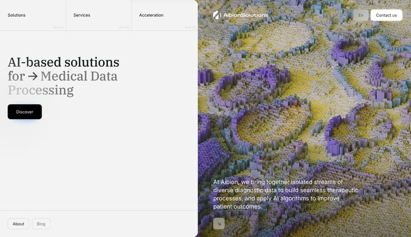
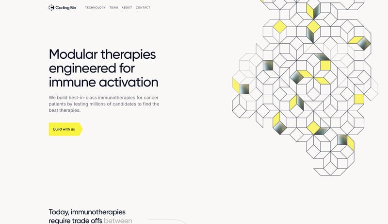
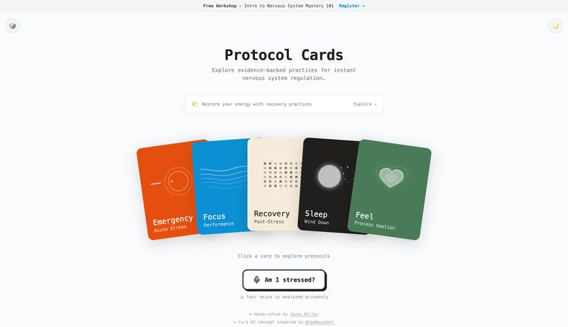
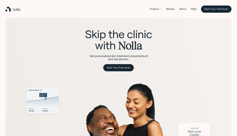
Open exampleKeep the system quiet, pale, and card-led. Use serif headlines to give the otherwise technical page a measured editorial center. Let compact black CTAs punctuate the flow without making the whole page feel promotional. M...
- Keep the system quiet, pale, and card-led.
- Use serif headlines to give the otherwise technical page a measured editorial center.
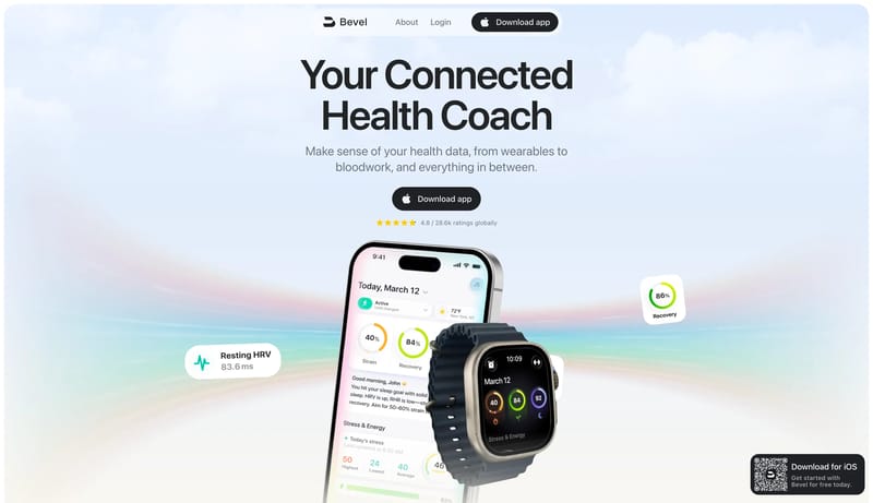
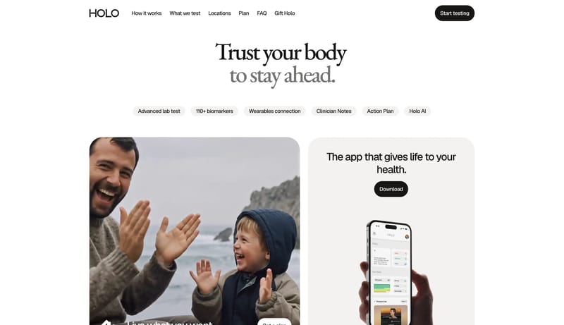
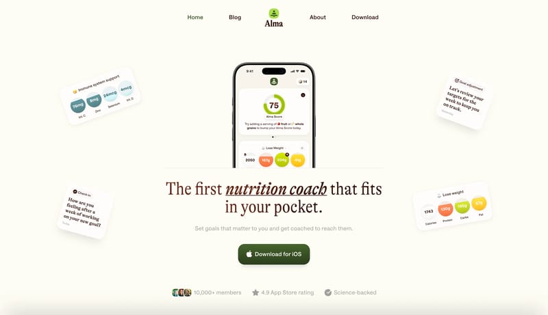
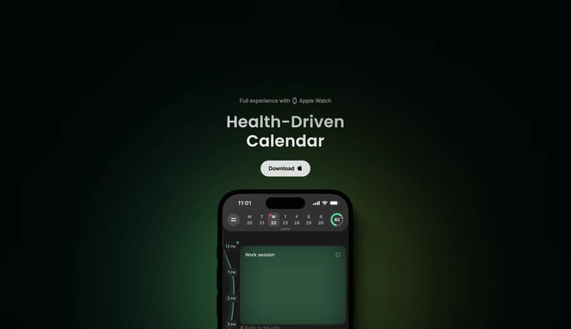
Open exampleBuild the page from calm white space, soft gradients, and device proof. Anchor trust with one charcoal action button or one dark reassurance block per chapter. Keep the surface polished and modern without tipping into ge...
- Build the page from calm white space, soft gradients, and device proof.
- Anchor trust with one charcoal action button or one dark reassurance block per chapter.
Open example